
The Inkscape logo.
Between actual work and a few extra-curricular gaming projects, recently I’ve faced a bunch of vector graphics tasks. Combined with a total lack of desire to boot up my ancient MacMini to use Adobe Illustrator, in doing them I’ve been experimenting with using Inkscape (on my Linux laptop) much more intensively than I ever have before. Coming in with a fair amount of familiarity with Illustrator, it’s interesting looking at the differences between them. Obviously there’s the cost, available extensions, books, the file sizes of produced content (Inkscape tends to produce much smaller files), etc., as noted in many comparisons. But they actually differ in more meaningful conceptual ways—not that a $600 sticker price difference isn’t meaningful (Inkscape is free and open source)…
A notable point in this is that I’m working from the latest development version, compiled from source from the repository. A new stable Inkscape release hasn’t been made in some time, and there are a bunch of improvements in the latest code. That said, they don’t seem to be radical improvements or additions, so for those not looking to compile from scratch, you should give the stable download a try. These notes all refer to build of Inkscape 0.48+devel r13026 (Feb 13 2014).
Objects & Strokes
A big implicit difference between the two is what are actually the first-order entities. To me, Inkscape is focused around objects while Illustrator is focused around paths. It’s a little bit of a fuzzy comparison because you can largely work on either in both. But you can see it in how the tools work, how the UI is presented, and so on. For example, in Illustrator you frequently wind up with many orphaned individual points floating around, so much so that there’s a menu option to select all unconnected points. I don’t think that can happen in Inkscape, certainly at least not easily. In general although very feasible, the tools to manipulate individual points aren’t as up-front and immediately obvious to complete beginners in Inkscape as in Illustrator. It’s just a different approach to thinking about what makes up the graphics.
Somewhat counter-intuitively then, by default Illustrator essentially treats strokes as decorators on a path (object) while Inkscape by default treats them as important, integral components of the objects. A key way this difference shows up is in calculating the dimensions of objects. In Inkscape by default the stroke width is included, so a box 32pt wide with a 1pt stroke will actually be 33pt wide. If you then manually resize the box by entering a width, say of 64pt, the box itself will be 63pt wide with a 1pt stroke (assuming you turn off the stroke scaling). Similarly, changing the stroke width will change the listed dimensions of the box. Clearly there are times this is useful, but it can make some tasks like precisely arranging objects more difficult and unmanageable. Fortunately in both system this is just a setting. In Inkscape, Edit → Preferences → Tools → Geometric Bounding Box will make strokes not be considered in calculating dimensions. In Illustrator, Edit → Preferences → General → Use Preview Bound will do the opposite and make strokes be considered. So, this isn’t in practice a huge difference since both support either style, but the different default can catch you off guard and is symptomatic of different mindsets approaching graphic design.
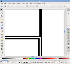
The kind of thing that can happen when you place objects with the strokes considered in the dimensions, and then change the strokes; these should be three stroke-overlapping boxes, i.e., just two lines visible on screen.
Hierarchy
Inkscape has a bit of a reputation of being incomplete. Unfortunately, it does indeed seem less actively developed and extensive as some other notable open source programs like GIMP. That makes sense given the comparatively smaller portion of the population out there interested in vector graphics design. Despite that rep, Inkscape is certainly very usable and stable. You can do both a lot of simple day-to-day tasks and more serious projects. It’s by no means incomplete in the sense of “Can’t be used for real work yet.”
However, once you start to use it more serious, Inkscape is unfortunately missing one or two critical things. Foremost among these to me is a more capable objects/layers view dialog. You can sort of use the XML view to do that, but it doesn’t quite work well enough. For some people it might be confusing looking at what is literally a display of the XML tree. In particular, all the XML junk often pushes the actually useful object labels, things the user actually sets to name their object, out of the view. Super annoyingly, you can’t select multiple objects in the view, and it doesn’t indicate well where objects are going to go as you’re dragging & dropping them to arrange the tree. Layer and object visibility also cannot be controlled from this dialog, e.g., to temporarily turn something off and see other objects. All in all, it’s not nearly as nice as the hierarchy view in Illustrator. I use that panel constantly there, so its lack here is a major one for me, and nearly a deal breaker. The current hierarchical view available in Inkscape is little more than a debugging tool for developers. This seems like a comparatively simple component to add and an utterly obvious capability, so I have no idea why it’s not present.
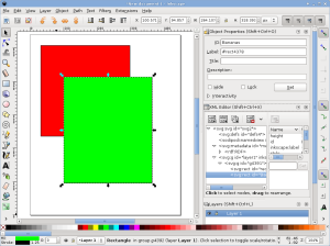
The XML editor dialog.
Control
Where Inkscape does really well is having accessible, detailed controls. In that same screenshot above, up on the top right are four toggles determining whether scaling an object affects the stroke widths, if rounded corners radii scale with objects, and whether patterns and gradients move with objects. In Illustrator the stroke width option is controlled by some checkbox buried in Edit → Preferences → General. You can also set that per manipulation as a drop-down checkbox from the Transform dialog, but that then only applies to those manually specified actions. Given that this setting is something you often want to control per manipulation, and in no way a document property, Inkscape’s approach of having it up front is much more convenient. I don’t even have the vaguest idea where the other options might be in Illustrator, and doubt they exist. In particular, from the Transform box you only have the option of scaling stroke and effects together. Unlike in Inkscape you couldn’t, for example, scale stroke but not corner radii—it’s one or the other.
Similarly, along the right of that screenshot are a ton of toggles controlling how objects snap together: On bounding boxes, along paths, at nodes, and so on. It’s a really fine grained level of control over the interface behavior. As far as I know there’s much less available in Illustrator to control how objects snap, and it’s certainly not as readily accessible to quickly modify. Unfortunately that snapping in Inkscape doesn’t always react really responsively to the actual elements as you move around, you often need to kind of hover it there before the indicator appears, an aspect Illustrator also generally isn’t ideal at. However, the conceptual intent here of utter, immediate control, is great.
As a final example of control, Inkscape has somewhat more explicit alignment controls, shown below. In Illustrator you Alt-click on an object in a selection to indicate the anchor around which the rest of the selection will be aligned. In Inkscape you have a drop-down for whether the anchor is the first or last object selected, the page, the biggest or smallest object, and several other options. Sometimes it’d be nice to be able to click on a key object directly, but this style makes it really fast to do a bunch of repetitive alignments. Options like aligning to the page are also particularly useful features somewhat lacking in Illustrator, in which you often have to make scrap or invisible objects for precisely aligning other objects. One thing that does seem to be missing in Inkscape is a really good distribution control. The tools present just don’t support quickly doing simple things like lining a bunch of objects out by X points along an axis. There are some capabilities, but you either have to deal with pre-arranging the objects into rough positions and other inconveniences, or do repeated alignments and moves.
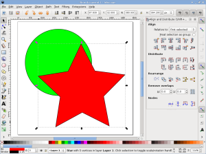
Inkscape object alignment and distribution controls.
Mental Game
In general, what these examples get to is that Inkscape and Illustrator just have very different mindsets about where controls go, the workflow to do different tasks, and to some extent the underlying conceptualization of graphics. It’s actually counter productive being comfortable with Illustrator as there’s such different interface style and processes in play. As another small example, double clicking on the selection tool button in Illustrator brings up a quick dialog to move an object by a specified amount, very handy for moving objects on a specific grid and such. In Inkscape that dialog is an option under the Object menu, and when open lives in the right-side bar unless you undock it. In general so far I’ve found that Inkscape does actually by and large have the tools and features I want to do real work. I just need to forget almost everything I know about manipulating the Illustrator interface and look up any questions I have, lest I incorrectly assume some feature I can’t find in the place I expect isn’t implemented in Inkscape.
As a small but important note, Inkscape is also stable like you’d expect from a normal, everyday piece of software. There is also a fair amount of documentation, blogs, and forum posts available to answer questions about particular tasks. For those that haven’t worked with Illustrator, the latter has a steep learning curve. To a large extent that’s an intrinsic aspect of any such powerful software with many features and options, but it also has a number of important keystrokes, mouse modifiers, and so on that you would not guess without reading documentation.
Inkscape also has the learning curve of any such software, but I could believe that to a newcomer—not someone coming from Illustrator—it’s actually to a large extent easier to learn. The buttons are more overt and the status bar does a better job informing you of different modifier keys and so on for the current task. Inkscape also tends to have fewer “magic” tools, and many operations have a stronger sense of a mechanical series of actions manipulating the graphics. In many ways you can feel yourself directly working on the underlying representation. If you’re at all familiar with how these graphics are captured in memory or the SVG file format you can often pretty easily conceptualize exactly what’s going on under the hood. On the one hand that can at times be frustrating and feel slow, particularly coming from an Illustrator background where many things are hidden. On the other hand, that can also make the whole process much more opaque and understandable, and that mentality is I think a large part of how and why so many options and controls wound up explicitly presented.
Conclusion
All in all, despite expected frustrations trying to transition over from Illustrator, I’m finding Inkscape pleasantly capable. Coming from that background I at first felt limited and falsely assumed a number of features and tools weren’t present. However, I’m finding less and less I can’t do as I become more acclimated to the workflow mentality, interface style, and force myself to look up features like the totally new user I actually am. Provided you’re willing to sink effort into (re-)learning, I’m encouraged to recommend it to Linux users looking for a good graphic design package, or anyone seeking a no-cost alternative.

Example from the Inkscape homepage. If RebirthArt could make this in Inkscape, you can probably do whatever diagram or whatnot you need to do. (click through for their DeviantArt page)
 I wound up with a AGPTEK A20 because it’s cheap and would take a MicroSD big enough to cover my collection, without paying for somewhat redundant larger internal storage. As it turned out, I was correct in my surmise that in these commodity players it would be a pain to have music divided across both the internal and removable cards. Big tradeoff for this player that knocks about $10–15 off is that it has no Bluetooth support. It does though have FM radio and a recording feature for taking notes.


 One thing I discovered recently is that Haxe, via hxcpp, by default builds to a fairly old Android target platform. A consequence of this is that it uses software floating point emulation. But any Android device from ARM v7 on supports hardware floating point. Switching to this produces a dramatic speedup, assuming you’re ok with that requirement. To do so, use the