This past weekend I spent some time revamping the styling of some of my work and gaming documents. Generally I write all of these in LaTeX. Long story short, for the uninitiated, it’s a typesetting markup language. Somewhat similar to HTML, you write a text document peppered with commands and then run it through a compiler which produces a beautiful PDF or similar output. Even a marginally trained eye can identify the difference versus output from a word processor or web page, but most people will instinctively feel that the document is more professional.
Some of the foundations of LaTeX are a antiquated though. The initial release of the underlying engine (TeX) dates to 1978. I wasn’t even born yet, and I’m an old man with a child of my own now! An oft cited trouble area remains fonts. The compiler doesn’t just hook into your system fonts, and you can’t just dump any old font file into a folder and have it work.
Fortunately working with fonts has gotten vastly better in the ~16 years I’ve been using LaTeX. The needed supporting programs are included in the major TeX/LaTeX distributions now, and a few short notes are around for using TrueType Fonts (TTF) that will mostly work with pdflatex, such as this post. If you’re using XeTeX or LuaTeX then you probably have an easier ride, but are on your own.
Kerning & Ligatures
Sadly though, even in this utopic typesetting future of ours, there’s still always a gotcha! It’s not widely remarked, but that commonly cited process does not carry over kerning and ligatures.
Ligatures are letter and symbol combos that are handled specially by a font, e.g., an ‘f’ followed by an ‘i’ combined to have the dot of the ‘i’ (formally the tittle of the ‘i’) be the drop tail of the ‘f’ (formally the hood).

Commonly cited and used ligatures. (image from Wikipedia)
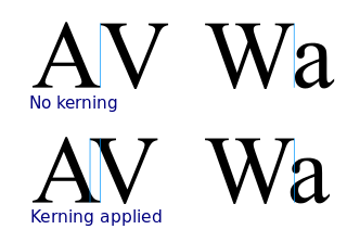
Kerning is adjustments to the inter-symbol spacing between characters, e.g., a ‘V’ followed by an ‘A’ should be pushed together to avoid creating a large visual space.

Commonly cited and used kerning examples. (image from Wikipedia)
That’s exactly how I realized the kerning of my fancy TTF fonts was not being carried through into LaTeX, when I saw this untidily spaced output:

Kerning fail!
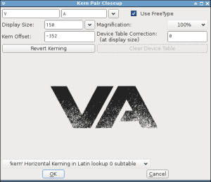
At first I thought maybe the font, having gone through the wringer of one shady font website after another, didn’t include kerning and ligatures. But a quick check in FontForge revealed all was well with the font.

Inspecting kerning in FontForge.
Conversion
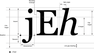
Long story short, in the still awful machinery that is TeX fonts, the compiler can only read shapes from the TTF font files. The metrics—height, width, baseline, etc.—need to be extracted out to a separate TFM file.

Font metrics. Oh hell yeah. (image from Apple Developer)
That TFM format can capture kerning and ligatures, but the standard conversion tools don’t include them. Instead you need to:
- From the actual original
.TTFfont, generate one kind of virtual font file, a.VPL, along with the font metrics,.TFM. - Generate another kind of virtual font,
.VF, and a second set of font metrics,.TFM, from that virtual font.VPL. - Provide a proper file index pointing LaTeX to the original
.TTF, both.TFMfiles, and the.VF, as a.FDfont definition file. - Don’t screw up along the way.
Really easy ways to screw up include breaking underlying assumptions about filenames. The suite of tools involved in that font conversion process and LaTeX itself employ a bunch of conventions about extensions, precedence, and lowercasing. So it seems best just to keep your filenames really simple, without capitalization, spaces, special characters, etc.. And don’t leave any extraneous files laying around, e.g., font metrics from the virtual file with the same name as the original file, because that will be used in the wrong place and not work…
In any event, here are the detailed steps. Throughout, you should replace ‘custom’ with whatever simple name you want to give your font. All of this is simply operating from the working directory for simplicity.
Make sure the filename has no special characters, or uppercase letters.
cp MyCrazyFont_v7..ttf custom.ttf
Download or locate T1-WGL4.enc (here, or possibly already on your machine at /usr/share/texmf-dist/fonts/enc/ttf2pk/base/T1-WGL4.enc or similar) and use it to generate a TFM and a VPL:
ttf2tfm custom.ttf -p T1-WGL4.enc -v custom.vpl
Generate another TFM and a VF, noting that these are now using a different file basename so the original TFM remains accessible:
vptovf custom.vpl virtcustom.vf virtcustom.tfm
Copy the following mapping into t1custom.fd, changing the references in the code and filename itself to whatever you’re using instead of custom, but keeping the t1 filename prefix derived from the encoding type:
\ProvidesFile{t1custom.fd}
\DeclareFontFamily{T1}{custom}{}
\DeclareFontShape{T1}{custom}{m}{n}{ <-> virtcustom}{}
\pdfmapline{+custom\space <custom.ttf\space <T1-WGL4.enc}
Note that this mapping points to the original shape file (custom), but the second virtual font & metrics (virtcustom)!
Use the following command in your LaTeX to switch to the font:
\usefont{T1}{custom}{m}{n}
After all that, the kernings will be done up nice and proper. Good luck!

Kerning success!